Revamping the Knowledge Section in OneClimate App
Overview
Company: OneClimate
Product: OneClimate App
Role: UX/UI Designer
Objective: Increase user engagement and content discoverability by redesigning the Knowledge section.
Introduction
OneClimate is a startup dedicated to helping users understand and measure their CO2 footprint while encouraging active participation in climate action. The app features a Knowledge section, designed to provide users with valuable information and articles on sustainability and climate change. However, the initial design of this section did not achieve the expected level of user engagement.
Problem Statement
The original Knowledge section was underutilized by users. The design was perceived as too heavy, and the information was deeply nested within different pages, making it difficult for users to realize the vast amount of content available. This case study documents the redesign process undertaken to address these issues, improve user experience, and enhance content discoverability.

Initial Challenges
User Feedback
Low Engagement: Users seldom accessed the Knowledge section.
Heavy Design: The initial design felt cumbersome and visually dense.
Poor Discoverability: Content was nested too deeply, making it hard for users to find and explore articles.
Redesign Objectives
Enhance Visual Appeal: Create a lighter, brighter UI with purposeful use of color.
Improve Information Architecture: Rethink the structure to make content more accessible.
Increase Discoverability: Design a feed that showcases different articles in various constellations and categories.
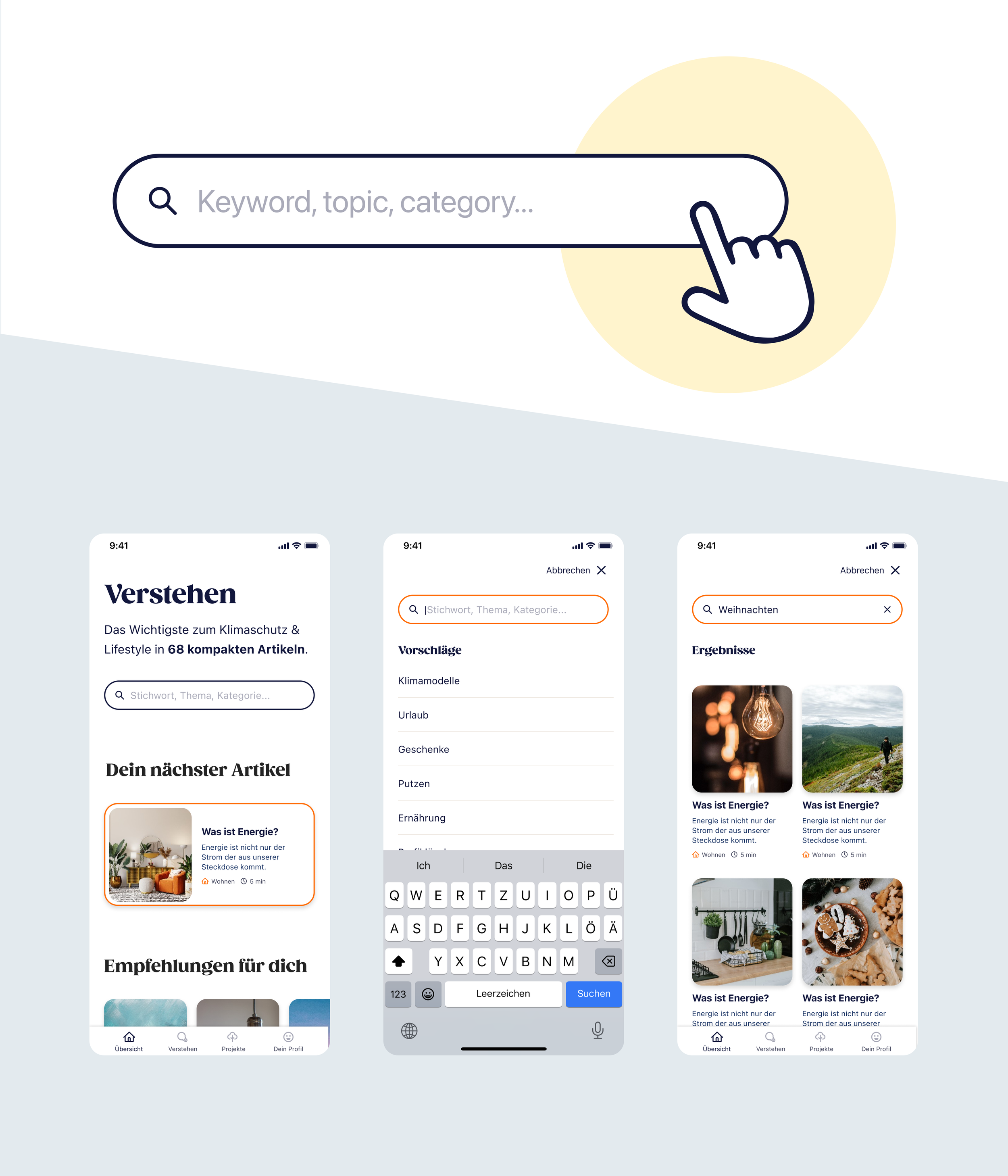
Introduce Search Functionality: Enable users to search for specific content easily.
Visual Redesign
Lighter and Brighter UI: I transformed the heavy design into a lighter and more inviting interface. Bright colors were used strategically to highlight key sections and create a more engaging user experience.
Purposeful Use of Color: Colors were used not only for aesthetics but also to guide users' attention to important elements and categories.
Knowledge exploration on the overview page
Several sections on the overview page: Different sections on the overview page make it easier for Users to browse through the different topics and see what amount of content is available in the app.
New Feature
Search Function: A search bar was added to the Knowledge section, allowing users to quickly find articles and information relevant to their interests.
Implementation
Design Tools and Methods
Tools: Wireframes and interactive prototypes were created with figma.
User Testing: Conducted user testing sessions showed the great improvement of this feature.
Implementation: Due to a very small tech team there was not the capacity to implement the changes in the app yet.


